Introduction
Accessible web links with descriptive, meaningful text help make your web content usable for everyone, improve accessibility for people who use assistive technology, and aid search engine optimization.
The HTML <a> element is a foundational concept for the Web. 1 Its primary purpose is to create a link that allows users to navigate to new content.
- Used to navigate to new web pages or other parts of the same web page.
- Used to request downloadable files; the browser may prompt the user to accept the linked file to be saved to their computer.
- Used with the
tel:ormailto:protocol to create clickable phone numbers or email addresses that can be handled appropriately by the user’s operating system.
Semantics
A common accessibility issue is the semantic misuse of links as buttons and vice versa. The two have distinct purposes; users of assistive technology will be confused if the choice of HTML element does not match the implied use case. The <button> element implies an action rather than navigation. Buttons are expected to perform some task on the current page, such as submitting a form or running a scripted behavior.
Even visually styling a link to look like a button can be confusing. Users may hesitate to click a link when it presents itself as a button which could have a more consequential effect, such as submitting data or modifying the current page.
Designer notes
When designing accessible links with accessibility in mind, consider the following points:
- Use meaningful link text. Use descriptive but concise, meaningful text for links that explain where the link goes. Do not use generic labels like “click here.” Users who navigate using a screen reader to display a list of links will better understand links with descriptive labels when shown out of the context of the page content.
- Use unique link text for each link: Unique labels for interactive elements make it possible for users who navigate by voice control to identify which link they want to interact with. For users who need clear, understandable interfaces, it will help them remember where they have been and navigate back to pages they have visited previously easily.
- Make links visually distinct from regular text: Use an underline or other differentiating font style for links in text. This may not be necessary where an element is obviously a link by its context, such as in a navigation bar. Be consistent and follow conventions. Don’t rely on color alone to distinguish links; not all users can perceive colors.
- Provide a touch-friendly link target: Ensure that links are large enough and separated sufficiently so that users can accurately click or tap them on small screens. A clickable area of 24 by 24 CSS pixels is recommended for links that are not in a sentence or block of text. Ideally, aim for at least 44 by 44 CSS pixels. Add space around links when presenting several adjacent links or other interactive elements together; this will be appreciated users with motor control issues, or anyone who may be on a bumpy train or bus commute.
- Avoid opening links in new windows: Consider the impact of opening new windows when unnecessary; it can disorient users, especially those using assistive technology.
- Provide labels for linked images or icons: Make linked images and icons accessible by providing descriptive alt text or supplementing with adjacent text that conveys the link’s destination.
- Clearly indicate keyboard focus: When a keyboard user moves focus to a link, it should display an easily perceivable focus style. But do not rely only on a change of color alone to indicate focus.

Learn more about accessible focus styles in our Focus Indication Guide.
Assistive technology experience
Screen reader list of links
Instead of reading the entire page aloud, screen reader users may prefer to only listen to a list of the available links. This is useful for index pages where users want to scan for a link they want to follow. In this case, the screen reader will only announce the text for each link independently, without reading any of the surrounding non-link content.

Keeping the length of each link short enough to fit in the screen reader dialog is helpful. In the example above, links over about eight words are clipped.
“Front-loading” your link text is also helpful for screen reader usability, meaning you should keep the distinctive parts of the link text near the beginning of the link. Listening to repeated texts at the start of each link can be annoying when scanning a list of links.
Selecting a link using voice control
People using voice control software can control their computers without a keyboard or mouse. They can select and click links using a two-step process when viewing a web page. First, they can use the command “Click” to display a number overlaid on each clickable element on the page, then they can say the number to follow a link.

It is much preferred by users of voice control software to use a one-step method of saying “Click” and the accessible name of an element (remembering that accessible name includes the visible text as well as any alternative text). Keep this option available when possible. In cases where the link is labeled by an icon or several links have the same text, the process may require two steps, as described above.
Selecting a link using the keyboard only
Users who navigate a web page using only a keyboard can press the tab key to move a virtual keyboard focus indicator from one interactive element to the next. Users expect the order this keyboard focus takes will follow the reading order of the language the web page is written in (generally left to right and top to bottom for web pages in English).
Once the user has moved the keyboard focus to a link they would like to follow, they can press the enter key to click the link.

Developer notes
Before you start
As part of the requirement for a designed accessible experience, you should confirm the design documentation for links has defined:
- The text label for each link.
- If the link is only an icon or other image, what the alternative text is for screen reader users and others who cannot see the image?
- The tab order for a series of links in a complex layout.
HTML structure
Link content
Navigable links are composed of content (also known as the anchor text, link label, or link text) and a destination in the form of a document fragment identifier or a URL (Uniform Resource Locator). For example, the content of a link could be text such as “Contact Us,” and the destination could be the address of a web page with information about contacting the organization.
<a href="http://example.com/cntc/index1">
  Contact Us
</a>
To be accessible, the link must contain text content or an alternative text equivalent. You must provide a text alternative for links with an image (or any other non-text) element as their content.
<a href="http://example.com/cntc/index1">
  <img src="/contact-icon" alt="Contact Us">
</a>
For this reason, it is not accessible to create links with no content (or content that cannot be assigned a text equivalent). For example, using CSS to set the background of a link to an icon effectively makes the icon invisible to screen readers, which generally ignore any visual styling. In those cases, the screen reader will fall back to reading out the href value instead. For example, without alternative text, the user would only hear “http://example.com/cntc/index1”.
When the visible content of a link is added using CSS, you might think you could improve the accessibility by adding an aria-label attribute, which would allow you to provide a text label for screen reader users. However, many other users would still be excluded if they were not using a screen reader but applied custom CSS overrides to make the web page accessible, such as in so-called reading mode.
<!-- don't do this -->
<a
  class="icon-contact_us"
  href="http://example.com/cntc/index1"
  aria-label="Contact Us"
></a>
Adding context to links for screen readers
Screen reader users who navigate by listing the links on a web page will miss the context of each link. Using distinctive, visible text to label each link text will help differentiate them for screen reader users and will likely help sighted users keep track of what they are linking to.
In some cases, such as a series of “Read more” links, where it would be distracting for sighted users to see the specific context in every link, adding the context as visually hidden text, available only to screen reader users, is a possible compromise.
The examples below demonstrate two techniques for adding context to a “Read more” link series without causing visual clutter. The first technique uses the aria-label attribute on a link to provide an extended label accessible to screen reader users. (Because this is a screen reader-specific issue, using a solution that only works for screen readers is acceptable.)
For a screen reader, the text of the aria-label attribute will replace the text in the link.
<h2>Our Values</h2>
<p>
  We support the environment and all the creatures who live in it.
  <a href="https://example.com" aria-label="Read more… about Our Values">Read more…</a>
</p>aria-labelledby attribute can reference the link text if it has an id, so you can provide a list of id values that include both a heading, for example, and the link itself to create a link name that combines the heading text and the link text. It’s a good way to ensure that the visible text is included in the computed accessible name.The second technique uses CSS to visually hide additional text that will appear as part of the link label for screen reader users and any other user that might override the web page CSS.
<h2>Fair Trade</h2>
<p>
  Our fair trade policy supports local farmers and communities.
  <a href="https://example.com">
    Read more…
    <span class="visually-hidden">
      about Fair Trade
    </span>
  </a>
</p>
Learn more about hiding web page content accessibly in our Hiding Things Guide.
While the two techniques in this section seem functionally equivalent, it is important to know that not every piece of text on a web page will be available to automated translation services like Google Translate. Some services will not translate text in an aria-label attribute, but all will translate visually-hidden text in the body of a link. It’s essential to test any translation tools or services your website plans to support to ensure the added text is supported by that service.
Icons in links
While having descriptive, visible text is the most accessible way to label a link, there are use cases where a well-understood icon would seem more natural. In these cases, alternative text must be supplied for screen reader users who cannot see the icon.
In the example below, we use an SVG element as an icon but provide visually hidden alternative text which will be available to screen readers. Choose an alternative text that summarizes the meaning of the image; there’s no need to explain that it is an “image,” “icon,” or “picture” in the alternative text.
<div class="social-links">
  <a href="#mastodon"><svg aria-hidden="true" focusable="false" class="icon icon-inline"><use href="/static/img/icons/social.svg#mastodon"></use></svg><span class="visually-hidden">Visit Us on Mastodon</span></a>
</div>The link with the mastodon icon would be announced by a screen reader like “link, Visit Us on Mastodon”
Learn more about accessible icons in our Icons Guide.
External links
When linking to external websites, it is a good idea from a security and accountability perspective to inform the user that they are about to visit content you are not responsible for.
Don’t rely only on CSS to warn users about external links (or links that open in a new tab). Because content included via CSS is not part of the web page Accessibility API, some assistive technology will not read it. In other cases, users may override the web page CSS to display it in a way that is accessible for them and so may not see content added via CSS. 2 Limit content added via CSS to decorative or supplemental content only.
The example below shows the text “(opens in new tab)” appended via CSS to links with a matching target attribute. A better approach is to add text or an icon to the link element content, as is demonstrated in the next section.
/* don't do this */
a[target]:not([target='_self']):after {
  content: ' (opens in new tab)';
}
New tabs
Opening links in new tabs or windows can make some users’ experience confusing and less accessible, so it should be used rarely but may be justified in the case of external websites as a way to warn the user before they follow the link.
In the following example, the user is notified that the link will be to an external website and will open in a new window. This information is part of the link text itself. We use CSS to enhance that notification by visually displaying a well-understood icon.
.is-external::after {
  width: 1em;
  height: 1em;
  margin: 0 0.15em;
  display: inline-block;
  vertical-align: middle;
  content: "";
  background-color: currentcolor;
  -webkit-mask-image: url("/static/img/guides/links-and-anchors/new-tab.svg");
  mask-image: url("/static/img/guides/links-and-anchors/new-tab.svg");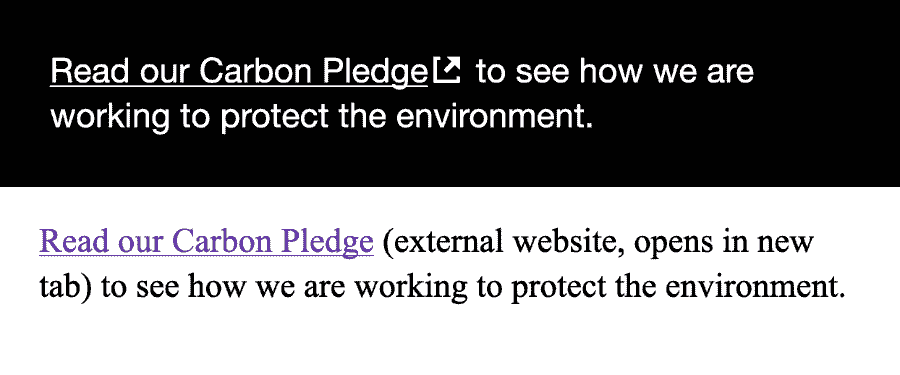
}<p>
<a
href="https://example.com"
target="_blank"
rel="noopener noreferrer"
class="is-external"
>Read our Carbon Pledge<span class="visually-hidden"> (external website, opens in new tab)</span></a>
to see how we are working to protect the environment.
</p>Read our Carbon Pledge (external website, opens in new tab) to see how we are working to protect the environment.